 CSS keyframes are a way to define specific stages of an animation in CSS. Keyframes allow developers to specify how an element should look at a certain point in time during the animation.
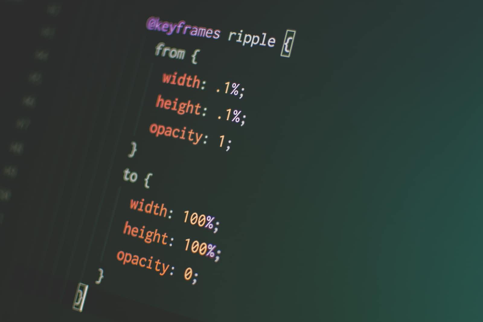
To use keyframes, developers define the animation in CSS using the @keyframes rule, followed by a name for the animation and the specific stages of the animation. For example:
@keyframes slide-in {
  0% {
    transform: translateX(-100%);
  }
  100% {
    transform: translateX(0);
  }
}
In this example, we’ve defined a keyframe animation called slide-in that moves an element from left to right on the screen. We’ve specified two keyframes: one at 0% that moves the element off-screen to the left using the translateX transform, and another at 100% that moves the element back onto the screen using the same transform.
Once the keyframes have been defined, we can apply the animation to an element using the animation property in CSS. For example:
.box {
  animation: slide-in 1s ease-out;
}
In this example, we’ve applied the slide-in animation to an element with the class .box, specifying a duration of 1 second and an easing function of ease-out.
By using keyframes in CSS, developers can create complex and dynamic animations that bring their websites to life.
How to use keyframes in CSS
To create keyframes for animations in CSS, follow these steps:
-
Define the
@keyframesrule: Start by defining the@keyframesrule in CSS, followed by a name for the animation. For example:@keyframes my-animation { /* keyframes go here */ } -
Define the keyframes: Within the
@keyframesrule, define the keyframes for the animation by specifying the CSS styles that should be applied at each stage of the animation. For example:@keyframes my-animation { 0% { opacity: 0; transform: translateY(-50px); } 50% { opacity: 0.5; transform: translateY(0); } 100% { opacity: 1; transform: translateY(50px); } }In this example, we’ve defined keyframes for an animation that fades an element in and moves it up and down the screen. We’ve specified three keyframes: one at 0%, one at 50%, and one at 100%.
-
Apply the animation: Once the keyframes have been defined, apply the animation to an element using the
animationproperty in CSS. For example:.box { animation: my-animation 2s ease-in-out infinite; }In this example, we’ve applied the
my-animationanimation to an element with the class.box, specifying a duration of 2 seconds, an easing function ofease-in-out, and an iteration count ofinfiniteto make the animation repeat indefinitely.
By following these steps, developers can create complex and dynamic animations using keyframes in CSS. With some creativity and experimentation, the possibilities for creating engaging and visually stunning animations are endless.
Applying keyframes to animations
In addition to defining keyframes in CSS, there are several animation properties that can be used to customize the behavior of keyframe animations. Here are some key properties to know:
-
animation-name: Specifies the name of the animation, as defined using the@keyframesrule.Example:
animation-name: my-animation; -
animation-duration: Specifies the duration of the animation in seconds or milliseconds.Example:
animation-duration: 2s; -
animation-timing-function: Specifies the easing function to be used during the animation. Easing functions control the rate of change of an animation’s speed.Example:
animation-timing-function: ease-in-out; -
animation-delay: Specifies a delay before the animation starts, in seconds or milliseconds.Example:
animation-delay: 1s; -
animation-iteration-count: Specifies how many times the animation should be played. The default is1, butinfinitecan also be used to make the animation repeat indefinitely.Example:
animation-iteration-count: 2; -
animation-direction: Specifies whether the animation should play forwards, backwards, or alternate back and forth.Example:
animation-direction: alternate; -
animation-fill-mode: Specifies what styles should be applied to the element before and after the animation plays.Example:
animation-fill-mode: forwards; -
animation-play-state: Specifies whether the animation is running or paused.Example:
animation-play-state: paused;
By using these animation properties in combination with keyframes, developers can create complex and customized animations that bring their web pages to life.
Examples of animations
Here are a few examples of keyframe animations that showcase the possibilities of this technique:
-
Bouncing Ball Animation:
@keyframes bouncing-ball {
  0% {
    transform: translateY(0);
  }
  50% {
    transform: translateY(-100px);
  }
  100% {
    transform: translateY(0);
  }
}

.ball {
  animation: bouncing-ball 1s ease-in-out infinite;
}
In this example, we’ve created a keyframe animation that makes a ball bounce up and down the screen using the
transformproperty. The animation loops infinitely and lasts for 1 second. -
Fade-In Animation:
@keyframes fade-in {
  0% {
    opacity: 0;
  }
  100% {
    opacity: 1;
  }
}

.fade-in {
  animation: fade-in 2s ease-out;
}
In this example, we’ve created a keyframe animation that fades an element in using the
opacityproperty. The animation lasts for 2 seconds and uses an easing function ofease-out. -
Spinning Cube Animation:
@keyframes spin {
  0% {
    transform: rotateY(0);
  }
  100% {
    transform: rotateY(360deg);
  }
}

.cube {
  animation: spin 5s linear infinite;
}
In this example, we’ve created a keyframe animation that spins a 3D cube around its Y-axis using the
transformproperty. The animation loops infinitely and lasts for 5 seconds.
These examples show just a few of the many possibilities for creating dynamic and engaging animations using keyframes in CSS. By experimenting with different CSS properties and keyframe configurations, developers can create animations that truly bring their web pages to life.
Conclusion
CSS keyframe animations are a powerful tool for creating engaging and interactive web experiences. By defining keyframes that specify the changes in CSS properties at various points in time, developers can create complex and customized animations that add visual interest and interactivity to their web pages.
With this knowledge, developers can begin experimenting with different keyframe configurations and animation properties to create animations that are tailored to the specific needs of their web projects. By using CSS keyframe animations in conjunction with other web development tools and techniques, developers can create truly engaging and interactive web experiences that captivate users and keep them coming back for more.